ARTIST SPOTLIGHT: YOSKAY YAMAMOTO

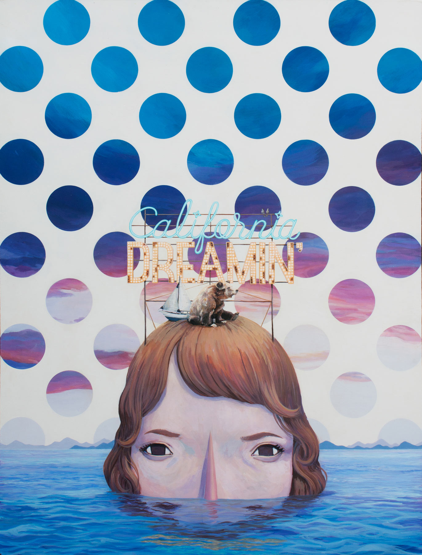
" let's stay till the stars fade out, " 2015

" let's stay till the stars fade out, " 2015

We recently had the privilege to collaborate with Los Angeles- based artist, Yoskay Yamamoto, on a local private commission project.  With a wide repertoire of materials and subject matter, his work is whimsical, graphic and fantastical.  His pop-style artwork takes us into his imaginary world, to a happy destination.  Born and raised in Japan, he moved to California for high school and never looked back: he has since called CA his home. We interviewed him about his inspirations and his creative journey.

1. You work in many different mediums, from painting, sculpture, murals and toys.  From which medium did you start?  Does one particular medium speak to you the most?  Why?

Originally, I started working on my art in sketchbooks, drawing some characters and copying other artists’ work that I admired.  Then I picked up painting when I was in college and eventually moved on to sculptures which led to designing toys.

At the moment, I really enjoy creating installations.  I like that I can incorporate all the different mediums into a single art work.  Also I enjoy that installation can take over a space and the audience can engage physically with my art. 

"wish you were here..." 2016

"wish you were here..." 2016

"hope it would reach you eventually" 2016

"hope it would reach you eventually" 2016

2. At which gallery are you represented in CA?  

I work with Giant Robot on Sawtelle Blvd in Japantown in West Los Angeles; that’s my home gallery and my happy place.  I have a solo exhibition coming up on 11th of November. I’m still playing with the title and so far I came up with “ Homebound, “ but not sure if that’s gonna stick.  I like the idea of people in search of their place to call home.  Being part of the immigrant culture in the US, I feel that’s an appropriate title for my next show.

3. You mentioned that you used to live in San Francisco.  How did living in the Bay Area shape your artistic vision/growth?

I lived in San Francisco 12 years ago, first by Candlestick stadium and then relocated to the Mission district afterwards.  I moved to the city to pursue art; at the time, it felt very exciting and a lot of the artists that admired lived there.

I always carried my portfolio with me and went to a lot of galleries to see if they would give me a show. In the end I wasn't able to exhibit my work in the galleries I had hoped for, but it definitely taught me how to handle rejection and work harder to create my art.  I ended up dropping out of school to spend more time painting.

Another good experience for me was meeting the local artists and having a chance to talk to them about art.  People like David Choong Lee, Sam Flores, and Mario Martinez were very inspiring to talk to and had a very genuine way of talking to a young artist like me.  It wasn’t much of a technical growth period as an artist, but living in the city definitely fueled my creative soul and helped me to commit to my art on a deeper level.

4. Which artists inspire you?  Who do you respect and admire?  One artist from the past and one contemporary.

I have too many artist on my list to just name one, but people that inspire me the most are my artists friends and others artists in our art community.  A lot of Giant Robot artists inspire me greatly and I feel lucky to live near the city where great exhibitions take place constantly at different galleries and museums.

5. What is the single most important message you want to relay through your art, to the viewer?

Currently, I’m focusing on creating art work that sends or creates positive energy or a good vibe when the viewers see them.  If I can uplift people’s sprit or make them smile, I feel that I have done my job as an artist. :)

"pale blue present moon" 2015

"pale blue present moon" 2015

Kaoru, Yoskay & Sara @ Izakaya Rintaro, SF, summer 2017

Kaoru, Yoskay & Sara @ Izakaya Rintaro, SF, summer 2017

"wish upon me" 2014

"wish upon me" 2014

Los Patios: Danish Design in Granada

For the last five years, our family has ventured to Central America during our children's winter break. It's a time for us to soak up plenty of sunshine and warm weather, while seeking out unique facets of local design and culture. Nicaragua left a lasting impression on us and we found ourselves in awe of the radiance of the city of Granada.

After a stay at a remote beach resort, we made our way into the city. Outdoor cafes were bustling and the energy of this artistic community was thriving. We absorbed stretches of colonial architecture, cobblestone streets, and brightly painted dwellings with lush internal courtyards. The ornate metalwork on doors and gates was a sight to behold.  

We chose to hang our proverbial hat at the stunning Los Patios Hotel, owned and operated by a husband & wife team who came to Granada in 2007 with the intent to establish a hotel that spoke to the colorful local landscape and their native Scandinavian aesthetic.  

The design of Los Patios hinges on the incorporation of bold black and white graphics, as shown in the cement floor tiles. From the patterned floors, simple yet richly colored walls rise up to meet timber-beamed roofs. Cool white stucco grounds these powerful design elements and open shelving keeps the storage elements accessible and light.

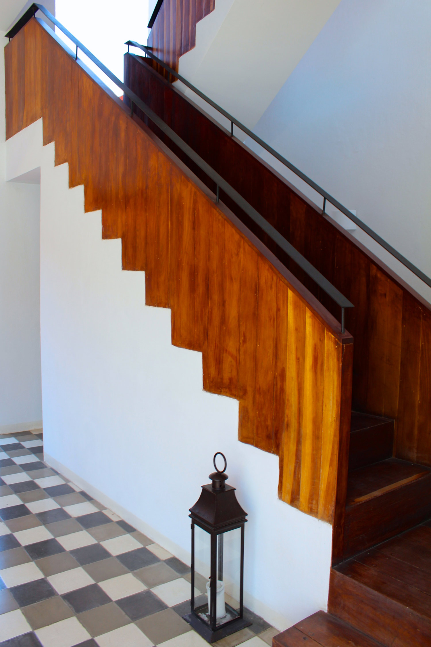
Custom architectural elements make the space look anything but ordinary, such as the positive/negative construction of the stairwell which was achieved by highlighting the simple interaction of stairs and walls with stucco and wool paneling. Cabinetry is given a modern, minimal approach through the use of concrete and weathered wood faces.

Lofty ceilings provide plenty of vertical space for adventurous, eye-catching pendants to dangle, such as this corner feature in our guest room. Like the rest of the hotel, our room brings together South American artistic traditions, like embroidered textiles made into pillows, and marries them with contemporary touches such as quilts made by hay from Denmark.

At the heart of Los Patios are eight sun-soaked patios that blur the boundary between indoors and out. You can chose to sway in a darling hammock or soak in the pool, get lost in a book on a lounge chair or cozy up for a nap on the shaded couch. 

Every nook of Los Patios oozes with visual and textural intrigue and the sight of bright sun dancing on it's colorful walls is a memory I'll happily revisit on a chilly San Francisco day.


Layered London Interiors by Kit Kemp : Charlotte Street Hotel

Kit Kemp, Design Director of Firmdale Hotels, is known for creating spaces that grab your attention and leave you longing to linger. She is the master of the quintessential boutique hotel, curating hyper-customized environments where contrast and layering are essential, and art and antiques have a strong presence. With eight hotels in London and a few spots in New York City, her unique vision continues to expand.

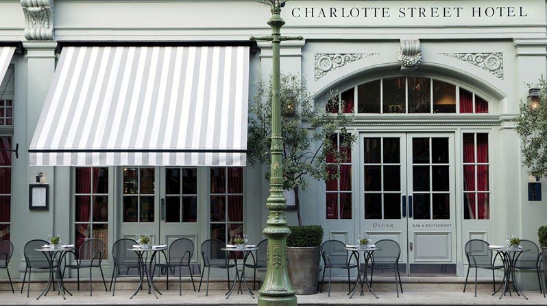
I had always wanted to visit a Kemp-designed hotel, so while visiting London we planned a high tea at Firmdale's Charlotte Street Hotel with my husband's aunt and uncle from Switzerland. His "tante", Michele, has great taste and has introduced me to some great designers like Sarah Lavoine, whom herself has designed gorgeous boutique hotels in Paris.

We enjoyed the tea service in Oscar Bar, a vibrant, mural-lined room that gives a nod to a time in English history when authors like Virginia Woolf were active. I was in awe of the attention to detail that went into the concept of the space, making it unique to this hotel alone.

Kit collaborated with Wedgewood for a series of tea cups, saucers and pots with motifs pulled from "Mythical Creatures," a pattern she originally designed for Chelsea Editions, a textile collection celebrating the rich tradition of English embroidery.  I appreciate her ability to see a clever motif and play with its application in new ways, from an embroidered cloth to a quaint tea cup. 

After tea, my husband's aunt and I introduced ourselves to the manager of the hotel and he kindly gave us a tour of the common areas and main suites. He generously spent over a half hour sharing insight into Kit's design philosophy and attention to detail and her low-key, friendly relationship with her employees. 

IMG_6424-for-web.jpg
IMG_6423-for-web.jpg

Kemp is committed to an awareness of where her products are made and contributes to the communities in which artisans reside. She is also focused on reviving skilled craft from local workshops in England. Her young daughters even jumped into the design of the Charlotte Street Hotel with the idea to take scraps from all of her projects and have a local studio make patchwork animals with them. We took home two adorable puppies for our children made from the remnants of some of my favorite fabrics. 

Galbraith & Paul's textiles, one of our favorite Philadelphia-based textile lines, were used on several chairs in their cozy den and library.  

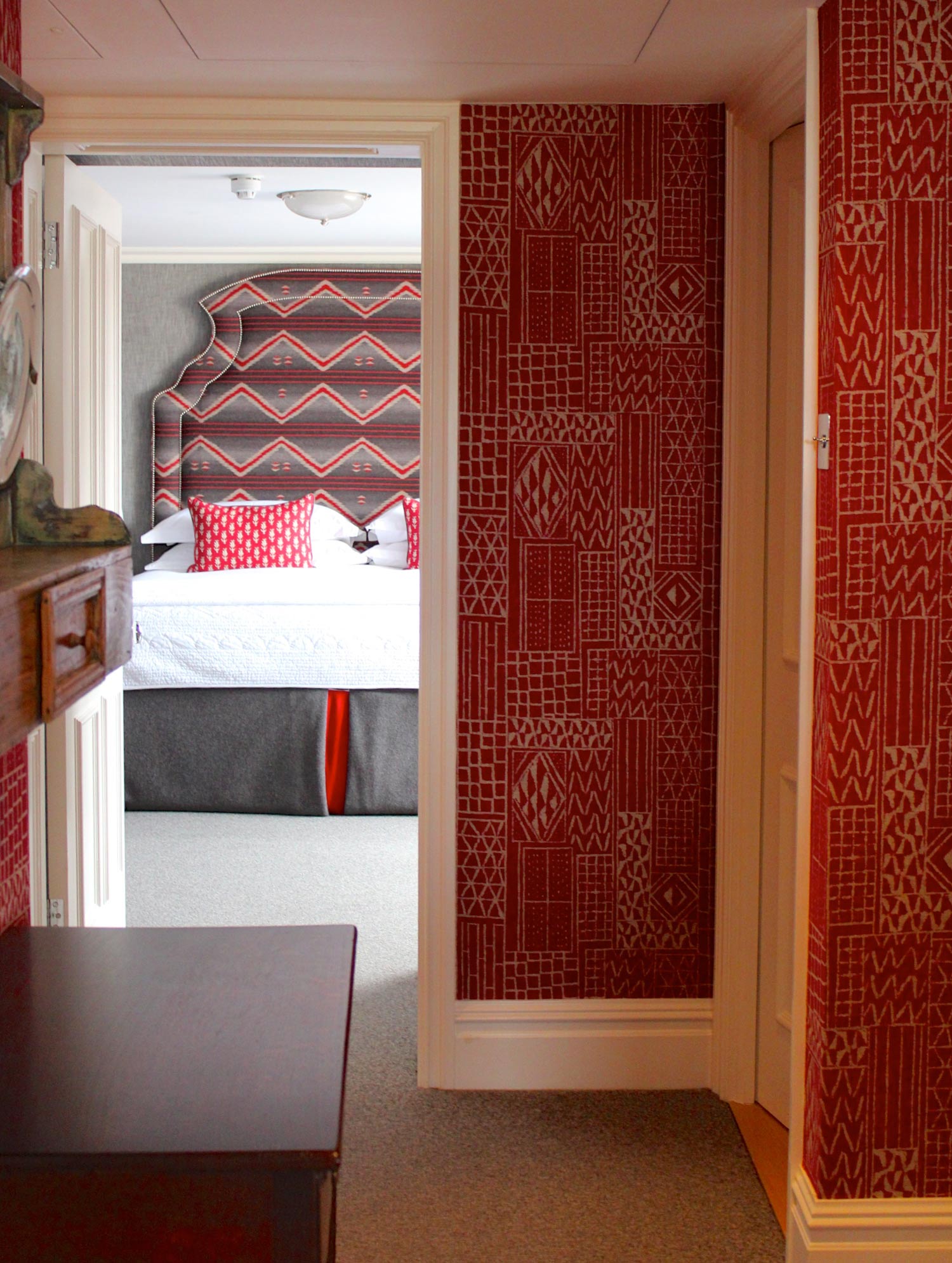
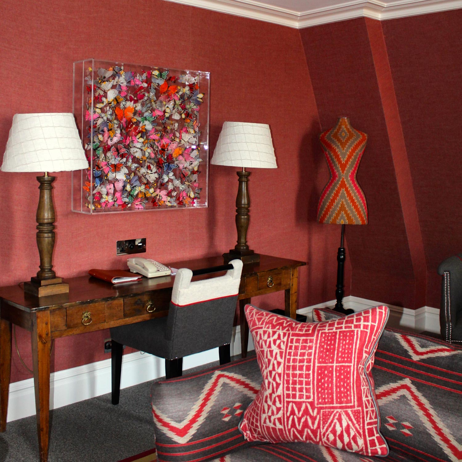
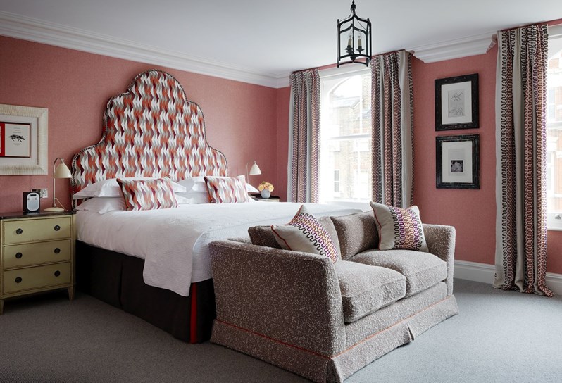
The rooms we toured were just gorgeous and personally touching, as they featured many lines that I consistently use in projects; companies who are not just design partners, but also friends. For instance, the grand headboard in this room was covered in "Fathom" by Christopher Farr Cloth, a line that Kit has collaborated with for some of our go-to fabrics.

Each guest room showcased the power of layered graphics and textures, bound by a common thread of color. 

As the hotel manager continued our tour, I pointed out several appearances by Seema Krish textiles and told him of our close relationship with the phenomenally talented San Francisco-based designer. He told us he's preparing to move to New York to manage a new Kit Kemp designed hotel where Seema's fabric will also be featured! 

Upon our glimpse around the accommodations at Charlotte Street Hotel, it was clear that no two rooms are alike - each fabric finds a unique application in a layered conversation of color, texture and print. As Kit has so appropriately named her book, "Every Room Tells a Story."